Clarity in Complexity
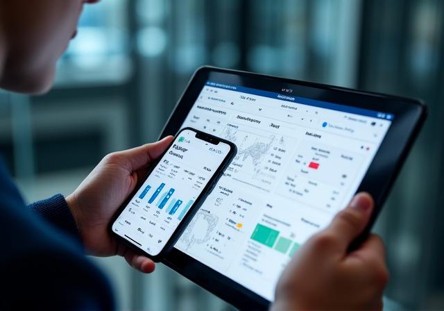
We transform raw data into intuitive visual narratives. Experience data visualization that doesn't just look beautiful but drives strategic decision-making through functional design.
Interactive Charts
Engage with your data through dynamic filtering, drill-down capabilities, and real-time updates. Our charts adapt to any device, ensuring insights are always at your fingertips.

Predictive Heatmaps
Identify patterns and outliers instantly. Our heatmaps provide a multi-dimensional view of performance metrics, highlighting areas of high activity and latent risk.

Geospatial Mapping
Visualize global trends with high-fidelity GIS integrations. Perfect for supply chain monitoring, market penetration analysis, and regional performance tracking.

The Intersection of UI/UX & Intelligence
At Beatific Bytes, we believe that data comprehension is a design challenge. Our visualization solutions prioritize the user experience, ensuring that even the most complex datasets can be interpreted in seconds.
- Mobile-Optimized Layouts
- High-Contrast Accessibility
- Instant Data Interaction
Note: All dashboards are engineered with a mobile-first approach, scaling seamlessly from 4K displays to smartphones.